“of those who die from avoidable, poverty-related causes, nearly 10 million, according to UNICEF, are children under five. they die from diseases such as measles, diarrhea, and malaria that are easy and inexpensive to treat or prevent.” ~peter singer
Background
Since reading one of Peter Singer’s books, Ethics in the Real World, I have often thought about health problems and disease in impoverished nations and how although so many people seem to be aware of the problems going on, people forget about it while they live their own lives. If you ask nearly anyone in the United States, they’ll probably agree with you that things like malaria are huge problems in certain regions of the world that need to be fixed. It is also true, however, that there is constant news about new cures, innovations, and solutions that are leading to declining rates of these problems. While these news stories are generally true and should inspire hope, I think that it is often overlooked just how big of a problem something like malaria is in the global context.
Earlier today, I found a data set released in 2017 by The Institute for Health Metrics and Evaluation (IHME), a health-focused research center based at the University of Washington. This data was later reformatted by Our World in Data (OWID). After looking into the data a bit, I thought that there were some very interesting and important facts to be found, which is why I wanted to share some of my findings on this blog.
What is this data?
First, lets take a look at how this data is organized.
## Rows: 270
## Columns: 3
## $ entity <chr> "Central Asia", "Central Asia", "Central Asia", "Central Asia",…
## $ year   <int> 1990, 1991, 1992, 1993, 1994, 1995, 1996, 1997, 1998, 1999, 200…
## $ deaths <int> 18, 18, 18, 19, 20, 20, 21, 22, 22, 21, 19, 17, 15, 14, 13, 12,…
Here we see that the data is pretty simple. There are three columns, being entity (representing the region), year, and deaths. Let’s look at what regions are being compared.
##                             entity  n
## 1                     Central Asia 27
## 2                        East Asia 27
## 3                           Europe 27
## 4  Latin America and the Caribbean 27
## 5     North Africa and Middle East 27
## 6                    North America 27
## 7                          Oceania 27
## 8                       South Asia 27
## 9                   Southeast Asia 27
## 10              Sub-Saharan Africa 27
Here we see that each of those ten defined regions has 27 corresponding pairs of years and death numbers (being the years 1990-2016). Now that you know what’s really being measured, here’s some interesting ways to visualize this data.
What does the data show?
First, we can look at the most simple measurement, being the total amount of malaria deaths each year across all ten of the measured regions.
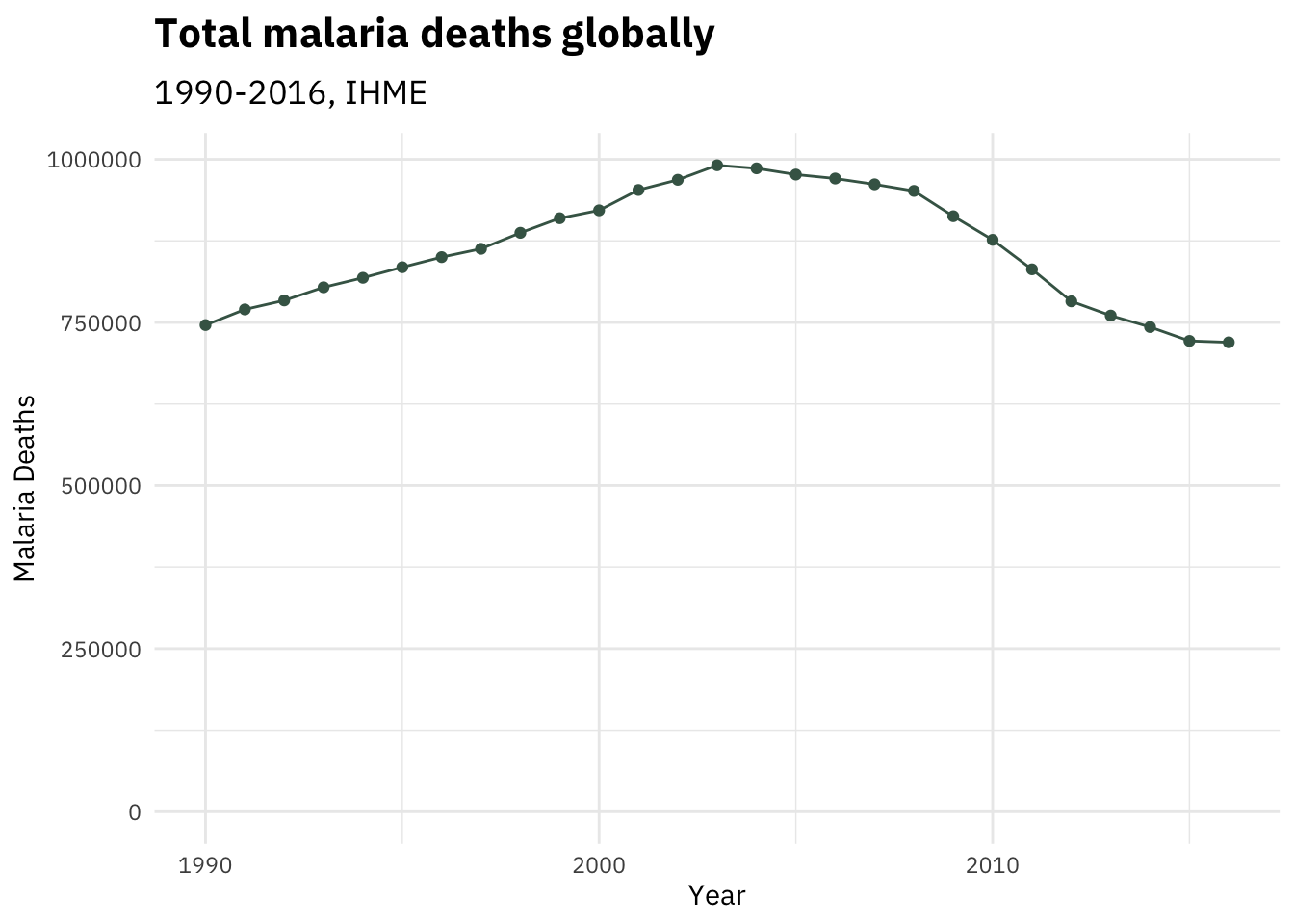 This alone tells a bit of an interesting story.
We first see that there were about 750,000 malaria deaths in the year 1990.
This number rose gradually over the next decade, peaking at around 1,000,000 deaths in 2003 before starting to decline.
It is interesting to note that the change between 2015 and 2016 is much more gradual than previous years, but that alone isn’t enough to make any kind of inferences.
This alone tells a bit of an interesting story.
We first see that there were about 750,000 malaria deaths in the year 1990.
This number rose gradually over the next decade, peaking at around 1,000,000 deaths in 2003 before starting to decline.
It is interesting to note that the change between 2015 and 2016 is much more gradual than previous years, but that alone isn’t enough to make any kind of inferences.
Lets look further into this data by breaking it down into each region. One way we can do this is by creating a different line to represent each region.
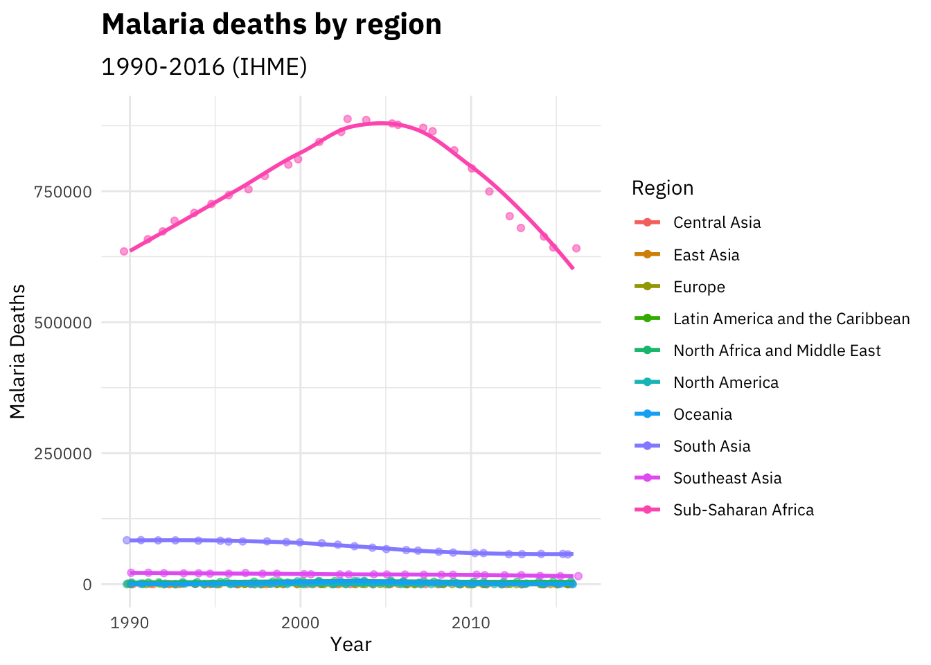 Now this gives us a greater understanding of where these deaths are occurring.
It’s clear that Sub-Saharan Africa makes up overwhelming majority of malaria deaths with even the next largest totals from South Asia and Southeast Asia making up a much smaller percentage.
Now this gives us a greater understanding of where these deaths are occurring.
It’s clear that Sub-Saharan Africa makes up overwhelming majority of malaria deaths with even the next largest totals from South Asia and Southeast Asia making up a much smaller percentage.
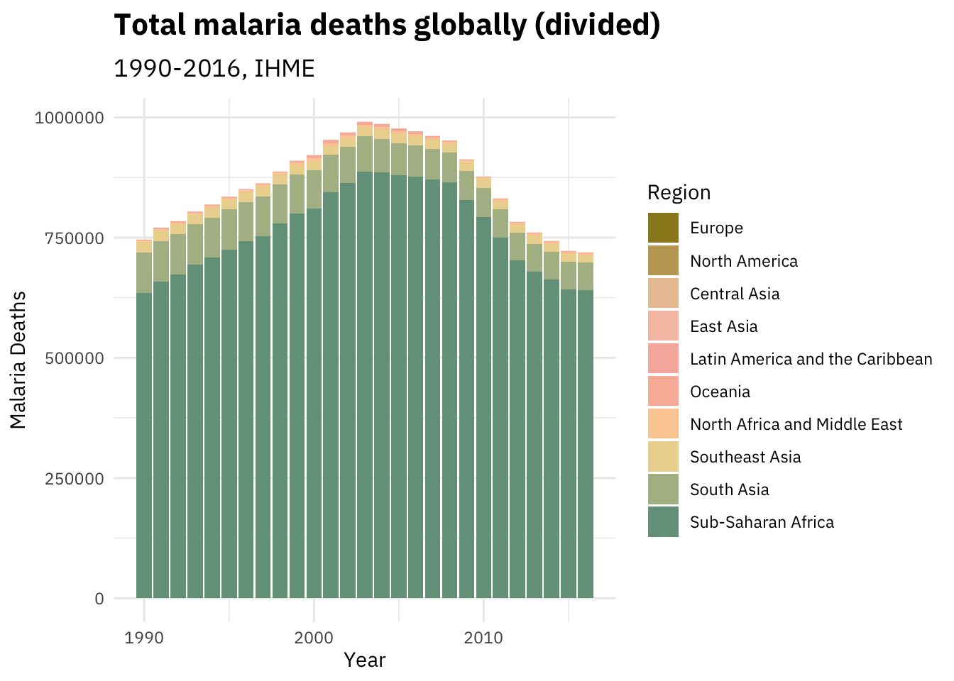
The last graph that I would like to show you is one that effectively combines the two prior ideas. While the first graph helped us understand the total amount of deaths due to malaria in the world, it didn’t give us enough context to be able to know where those deaths occurred. The second graph covered that gap, but made it harder to understand in terms of totals. Here, you’ll see a graph where each bar represents the total amount of deaths in a year, but with separate colors to break them down into regions.
What does this mean?
Through looking at this data, I hope that you have come to realize that although malaria is a problem that seems improving each year, it’s still no where close to being solved. More developed areas like North America and Europe have had the ability to not worry about the prevalence of malaria, even in the poorest areas of those regions. This is part of what makes it so hard for us to see something like malaria as a major problem, especially compared to problems like homelessness that appear in front of our eyes every day even in some of the most prosperous parts of our nations. Our limited exposure is typically in the form of a yearly update about a huge number that only gets put into context of improvement. This isn’t to say that the improvements in the last decade or so haven’t been extremely positive, I’d always be happy to see a reduction of hundreds of thousands of deaths. However, that doesn’t mean we should be inactive when it comes to 750,000 preventable deaths.
If you’re reading this and it’s within your means to spare just a few dollars (think of the kind of money that would otherwise go to a larger drink or an extra unused piece of clothing) - I would urge you to give just a bit of money to the Against Malaria Foundation. They have been rated as a top charity year after year by groups such as GiveWell and The Life You Can Save as a top charity due to their cost-effectiveness and ability to create long-term change. 100% (that’s right, 100%) of public donations go towards purchasing long-lasting insecticidal nets (LLINs) that protect against malaria, verifying that they reach their intended destinations in an equitable manner using household-level data, and making sure that they are kept in good condition.
The Against Malaria Foundation has been shown by GiveWell to be extremely transparent and efficient too, so you know that your money isn’t just getting stolen or funneled into some corrupt government. One LLIN costs just $3 and can protect a group of 3 people for up to 3 years. Just one more of these nets will provide a solid step closer towards eradicating malaria.
Ending notes
First of all, thanks for reading this post! I put a lot of work into doing the writing and data visualization for this, so be sure to give me some feedback about what you liked and what could be improved (or we can just talk about what I wrote about). Also, if you’re interested in seeing the source code for this post which includes all of the text and graph generation, you can check it out on my github.